Thursday, 25 October 2012
Illustrator Tutorial
http://www.youtube.com/watch?v=WDwwyyJDolw
This video helped me in illustrator because it helped me to make really cool designs. The video was very helpful, it gave tips and detailed instructions on how to work the tool. I could create better things now than I could before. It was a helpful tutorial.
3 Logos post #2
Alienware logo

It uses the element of color, the
bright blue eyes contrasting against the grey creates a nice, not overly
powering head. The positive space is the eyes and the thin blue line around the
head enclosing it. There is balance for this logo because it’s symmetrical,
that means it’s evenly balanced. I also see a little bit of pattern or rhythm,
even though the pattern (the eyes) is only repeated once.
I think the designer was trying
to express power because when you look at the way the eyes are, it seems to
stare at you, and push you down. I think the designer was also trying to
express a feeling of ‘out of this world’ because of the alien’s colors.
The
target audience for this would be teenagers. I think this because I think it’s
really good, and it says ‘gaming company’, and the colors of the alien are
cool.
Warriors logo

The elements this logo uses are
color because the letters are kind of reflecting. That gives the yellow more of
an orange color. The colors work well because they contrast.
I think the designer was trying
to express mystery because the letters are a certain way. That makes you think what is this? In a good way. The
designer might have been expressing stability because the letters are perfectly
straight.
The target audience is made for
young teens because of how the colors and the type of letters look. I also know
this because I read Warriors a year ago; I started reading it because the
covers, and the words appealed to me.
World Wildlife Fund
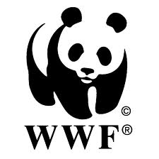
The elements
in this logo are contrast and unity. It’s contrast because where there’s white,
you can see the black shapes. It’s unity because the two colors connect into
each other. When one color ends, the other color starts.
I think the
designer was attempting to express the feeling of cuteness because the panda
looks like it’s smiling, which is always cute. I also think stability was being
expressed because the letters are blocky and big.
I think the
target audience is a wide range. Anywhere from 9-76. This isn’t a profit
company, it’s an organization. So it doesn’t really matter as long as you like
helping animals, you’re in the target audience.
Wednesday, 24 October 2012
Repitition and Symmetrical Pattern
Repetition…
Repetition is a replica or copy of the same small image or some object. It could also be a big image, as long as that image is repeated. Each image when put together should make a larger image.
Repetition is a replica or copy of the same small image or some object. It could also be a big image, as long as that image is repeated. Each image when put together should make a larger image.

Symmetrical patterns…
The symmetry in the pattern has to
be the same on both sides of the picture or image. The pattern comes in when
all the pictures or images are aligned in the opposite direction as the
symmetrical lines. To make it symmetrical it must to look the same on both
sides, you can think of it as one image being put beside a mirror. In seeing
the reflection it will help you understand better. The pattern, because of the
symmetry has to come together with the object or image because the pattern and
symmetrical lines together create the element of symmetrical pattern.
Symmetrical pattern is a pattern
that is the opposite on each side. In a way it could be said that; it’s a
mirror against the object or image at hand. A pattern has to be repeated.

Painting Squirrels & Always Create
Photography Comp-Soccer Field post #4

My picture was taken at the net of the soccer field. I think its interesting because the person is turned away from the camera and because the colour of the hoodie is very bright. I used the rule of thirds to place the person. I had her hanging off the goalpost because it was different and created an effect of loneliness, or as I said, "hanging on for dear life.". When I looked at the picture I noticed the white car was distracting so I had to change it a little. I really like this picture because of the brightness in the hoodie. It attracts attention, which is what i was trying to do. If I took out the light post i think it would look very different. to me it looks as if its separating the car and the person.
This photo shows the girl looking over the fence if you look closely. If i added a few small things it could look as if the ruled the world, but because she's hanging and she's facing away it looks lonely.
This photo looks really awesome because she and her colourful hoodie is facing away.
Subscribe to:
Posts (Atom)